Landing Page Secrets: How Better Pages Generate More Conversions
This highly detailed, 1000+ word article explores the critical elements of high-converting landing pages in 2026. Published by Twigital, a conversion-driven digital marketing agency based in Indore, India, it explains the difference between generating traffic and generating revenue. The guide outlines core Conversion Rate Optimization (CRO) strategies, including message matching, eliminating choice paralysis through single-goal architecture, implementing frictionless lead forms, utilizing authentic social proof, and ensuring blazing-fast technical performance. It serves as a masterclass for business owners and marketers looking to maximize their Google Ads and Meta Ads ROI by fixing their post-click experience.
Imagine walking into a high-end retail store. The window displays are stunning, the advertising that brought you there was incredibly persuasive, and you are ready to make a purchase. But when you step inside, the lighting is harsh, the aisles are a confusing maze, and you can’t find a single checkout counter. Frustrated, you walk out and go to a competitor.
This exact scenario happens millions of times a day on the internet. Businesses spend fortunes on Google Ads, Meta Ads, and SEO to drive thousands of visitors to their websites. Yet, they dump that hard-earned traffic onto a cluttered, confusing homepage. The result? Sky-high bounce rates, wasted advertising budgets, and an abysmal Return on Investment (ROI).
Driving traffic is only half the battle. The other half—the part that actually pays the bills—is converting that traffic. In 2026, consumer attention spans are shorter than ever, and tolerance for a poor digital experience is practically zero. If you want to scale your business, you need to master the art of the Landing Page.
At Twigital, we have analyzed, audited, and optimized hundreds of campaigns. In this comprehensive guide, we are pulling back the curtain to reveal the exact structural secrets and psychological triggers that separate a low-performing webpage from a high-converting lead generation machine.
Homepage vs. Landing Page: Understanding the Difference
Before diving into the secrets of optimization, we must clarify a fundamental digital marketing rule: Never send paid ad traffic to your homepage.
Your homepage is designed to be a digital brochure. It encourages exploration. It usually features a top navigation menu, links to your “About Us” page, a blog feed, multiple service categories, and links to your social media profiles. It is designed to satisfy a wide variety of user intents.
A landing page, conversely, is a standalone webpage created specifically for a targeted marketing or advertising campaign. It is laser-focused. It operates on a principle of isolation: stripping away all distractions to guide the visitor toward one specific action—whether that is filling out a form, booking a consultation, or making a purchase.
Secret 1: The Principle of “Message Match”
The highest-converting landing pages start before the user even arrives on the page. “Message match” is the metric of how well your landing page headline aligns with the ad copy that the user just clicked.
If a user clicks a Google Ad that says, “Get 50% Off Emergency Roof Repairs,” and they land on a page with a generic headline that says, “Welcome to Smith Contracting: We Build Homes,” they will immediately experience a cognitive disconnect. They will assume they are in the wrong place and hit the back button within three seconds.
✗ Poor Message Match: Ad promises a “Free SEO Audit.” Landing page headline says “Our Marketing Services.”
✓ Perfect Message Match: Ad promises a “Free SEO Audit.” Landing page headline says “Claim Your Free 2026 SEO Audit Today.”
Your landing page must instantly validate the user’s decision to click the ad. Mirror the exact phrasing, the exact offer, and even the exact imagery used in your advertisement.
Secret 2: Benefit-Driven Hero Sections
The “Hero Section” is the area of your website visible above the fold (before the user has to scroll). You have roughly 2 to 5 seconds to convince the visitor to stay. Most businesses waste this valuable real estate by talking about themselves.
Consumers do not care about your company history, your state-of-the-art software, or how many awards you have won. They care about one thing: “How does this solve my specific problem?”
A high-converting hero section consists of three elements:
- The Main Headline: State the ultimate benefit. (e.g., “Generate 3x More Leads Without Increasing Your Ad Spend”).
- The Sub-headline: Explain the ‘how’ briefly and clearly. (e.g., “Our data-driven CRO strategies turn your existing website traffic into qualified, ready-to-buy customers.”).
- The Hero Image/Video: Show the product in action or depict the emotional state of a satisfied customer. Avoid generic, corporate stock photos at all costs.
Secret 3: Eradicating Choice Paralysis
Hick’s Law is a psychological principle stating that the more choices a person is presented with, the longer it takes them to reach a decision. On a landing page, presenting too many options doesn’t just delay the decision; it paralyzes the user into taking no action at all.
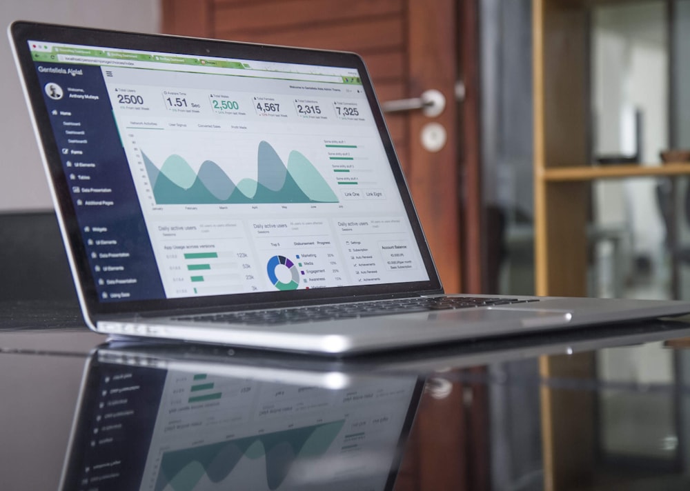
If your landing page asks a visitor to read a blog post, follow you on Instagram, subscribe to a newsletter, and buy a product, you will fail. A high-converting page has an Attention Ratio of 1:1. This means there is only one interactive element on the page: The Call to Action (CTA).
To enforce this, Twigital routinely removes the top navigation menu and footer links from our clients’ paid landing pages. The user has two choices: convert on the offer, or close the tab. This forced binary choice drastically increases conversion rates.
Secret 4: Frictionless Form Architecture
Your lead capture form is the final hurdle between a visitor and a conversion. Every additional field you ask a user to fill out acts as a physical barrier, introducing “friction.”
Do you absolutely need to know a user’s fax number, secondary phone number, company size, and home address just to send them a PDF guide or schedule an introductory call? No. Greedily asking for too much information upfront will tank your conversion rate.
To optimize your forms in 2026:
- Keep it to 3-4 fields: Name, Email, Phone Number, and perhaps one qualifying question.
- Use Multi-Step Forms: If you must ask 10 questions (e.g., for an insurance quote), break them up into a multi-step form. Start with low-friction questions (“What is your zip code?”) before asking for high-friction details (“What is your phone number?”). This leverages the psychological principle of commitment and consistency.
- Ditch the word “Submit”: “Submit” is a passive, negative word. Change your button text to reflect the value they are receiving: “Get My Free Quote,” “Send Me the Blueprint,” or “Book My Consultation.”
Secret 5: Unimpeachable Social Proof
In a digital world overflowing with AI-generated content and faceless brands, trust is the ultimate currency. If you make a bold claim on your landing page, you must immediately back it up with third-party validation.
However, users have become blind to plain text testimonials that say, “Great service! – John D.” They know these can be easily fabricated. To build genuine trust, incorporate high-fidelity social proof:
- Video Testimonials: A 30-second video of a real client speaking about their transformation is worth a hundred text reviews.
- Live Review Widgets: Embed dynamic review feeds from verified platforms like Google Business Profile, Trustpilot, or Clutch.
- Authority Badges: Display logos of publications you have been featured in, industry certifications, or secure payment icons (McAfee, Norton) near the checkout or form area to alleviate security anxieties.
Secret 6: Blazing Fast Technical Performance
You can implement every psychological trigger in the book, but if your landing page takes 5 seconds to load on a 5G mobile connection, 50% of your visitors will bounce before they even read your headline. This is a technical reality that cannot be ignored.
In 2026, Core Web Vitals are more than just an SEO ranking factor; they are a baseline expectation for user experience. To ensure maximum conversions:
- Compress all images using next-gen formats like WebP or AVIF.
- Minimize heavy JavaScript and remove unnecessary third-party tracking scripts.
- Utilize aggressive edge caching and Content Delivery Networks (CDNs) so the page loads instantly regardless of the user’s geographic location.
A one-second delay in mobile load times can impact conversion rates by up to 20%. Speed is revenue.
The Twigital Philosophy: Never Stop Testing
A landing page is never truly “finished.” It is a living, breathing digital asset that requires continuous refinement. At Twigital, we don’t rely on guesswork; we rely on data-driven A/B testing.
We deploy advanced heatmapping and session recording tools to see exactly where users are clicking, how far they scroll, and where they abandon the page. We systematically test different headlines, button colors, form layouts, and offers against one another to find the mathematical winner.
If you are tired of spending money on traffic that doesn’t convert, it is time to fix your post-click experience. Your next customer is already clicking your ad—ensure they have a landing page that makes them want to stay. Contact Twigital today for a comprehensive conversion audit, and let’s turn your website into your most profitable salesperson.
